Branding
Visual Identity re-brand for a Skincare company
Role: Brand Strategist & Brand Designer
Tools: Canva & AI productivity tools
Goal: Reposition Eternoa, an Italian skincare brand, to succeed in the US omni-channel market by clarifying its brand identity and elevating its perceived value.
About the brand
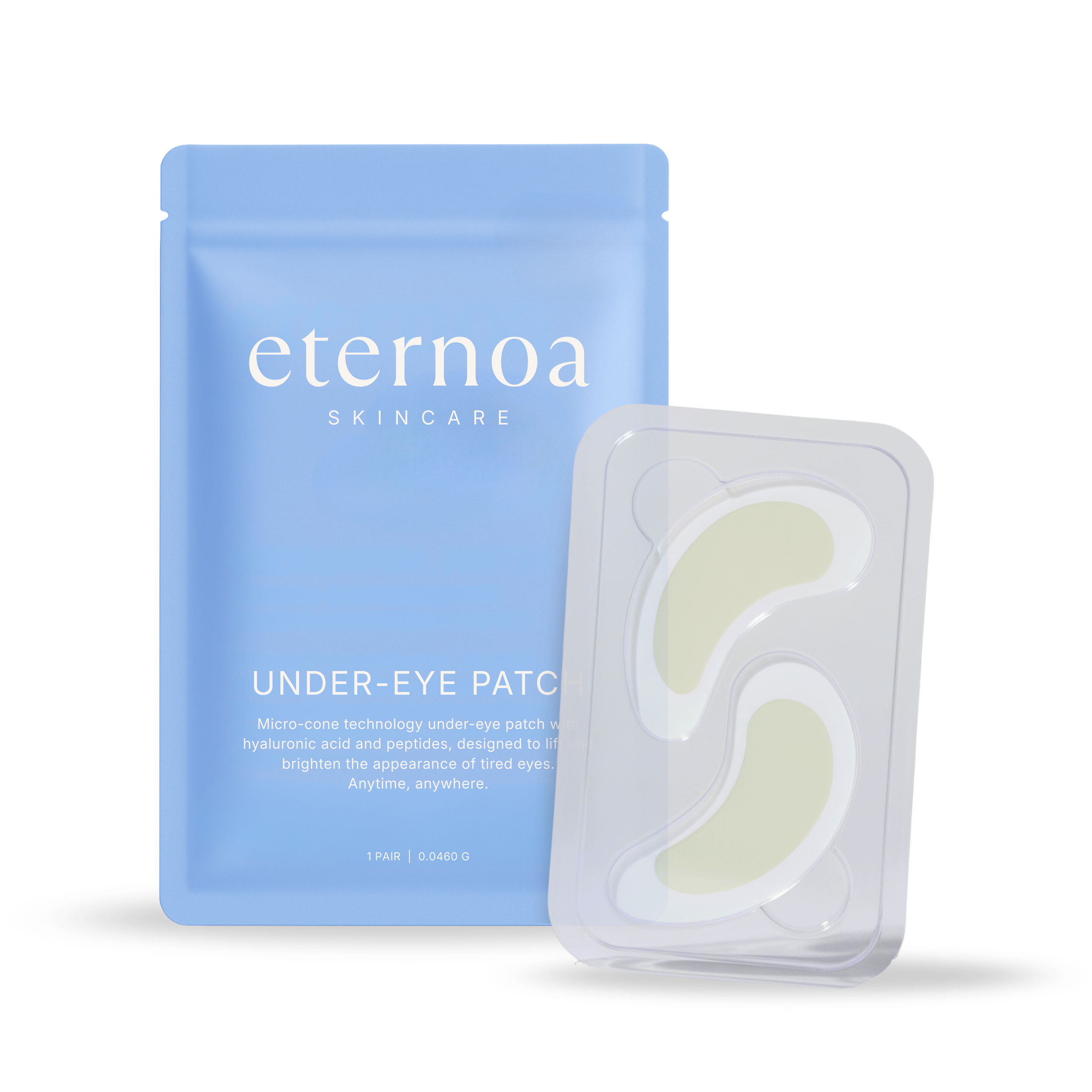
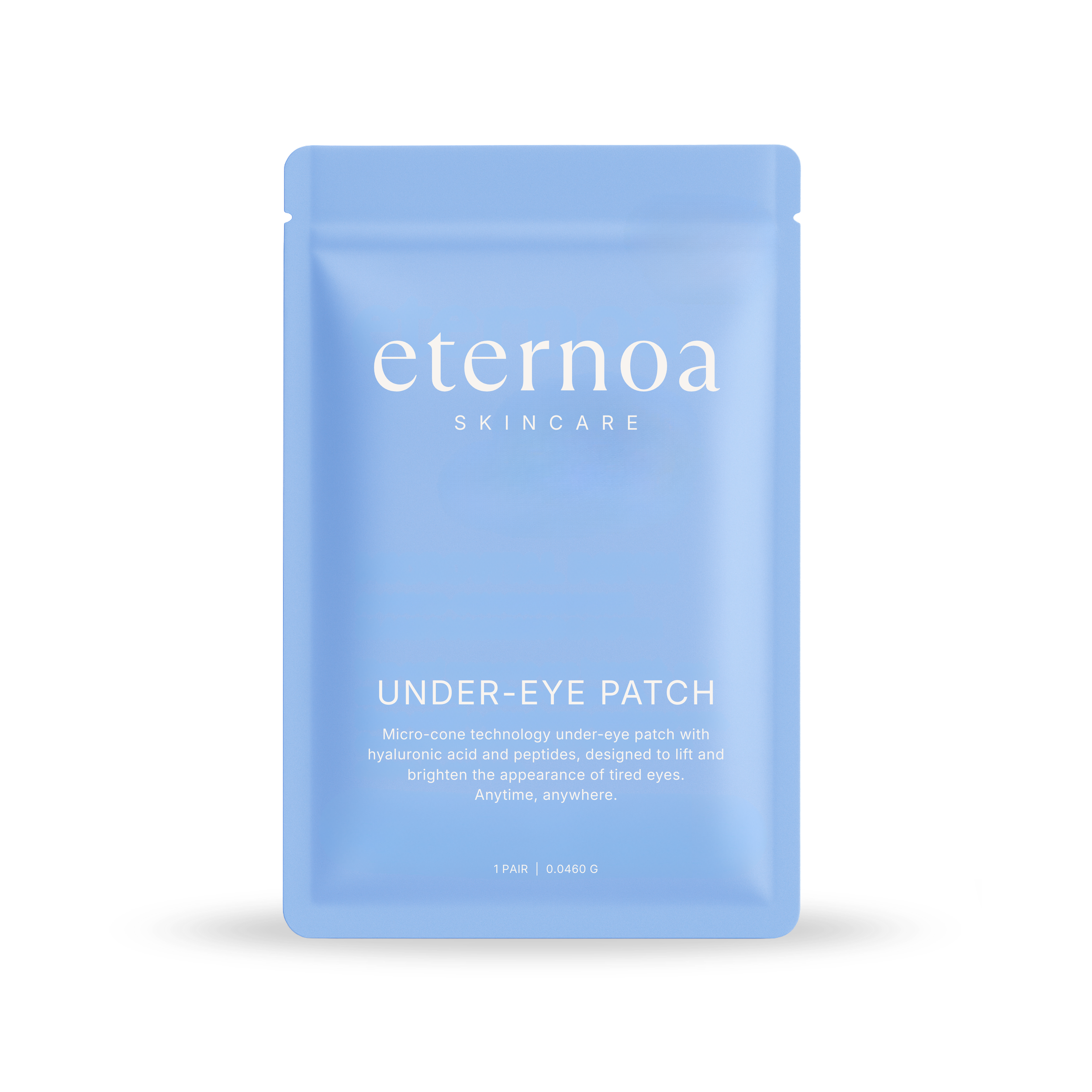
Eternoa is an Italian skincare brand designed for women aged 40 - 65 seeking effortless solutions for youthful-looking skin. The brand’s hero under-eye microneedle patches anchor a growing range of modern skincare essentials.
Key problems
Outdated Branding – Dated and overly text-heavy visuals
Inconsistent Identity – No cohesive voice or tone
Not US Market-Ready – Designed for Italian market not US
My goal
Reposition Eternoa as a cohesive, luxury-yet-relatable skincare brand for the modern woman, with a visual identity tailored for the US market and adaptable for digital and packaging use.
the Creative process
Step #1: Evaluate the existing visual identity
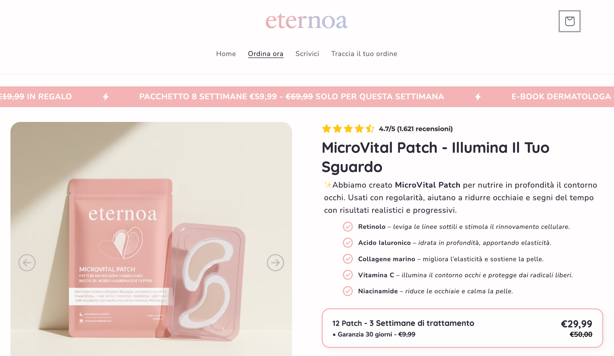
The original marketing felt generic, reducing Eternoa’s perceived value and calling for a more premium, luxury aesthetic for the U.S. market.
Step #2: rebrand for future use
The re-brand focused on creating a clean, sophisticated and scalable identity for future products and global english-speaking markets.
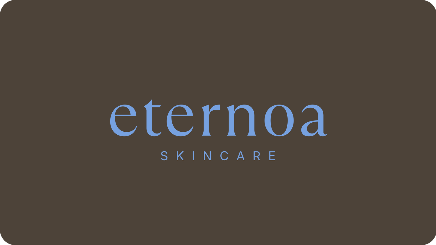
Primary logo
Secondary logos
Color palette
HEX: #F9F5F2
RGB: 249, 245, 242
HEX: #CFC6BF
RGB: 207, 198, 191
HEX: #76A1E0
RGB: 118, 161, 224
HEX: #4D4339
RGB: 77, 67, 57
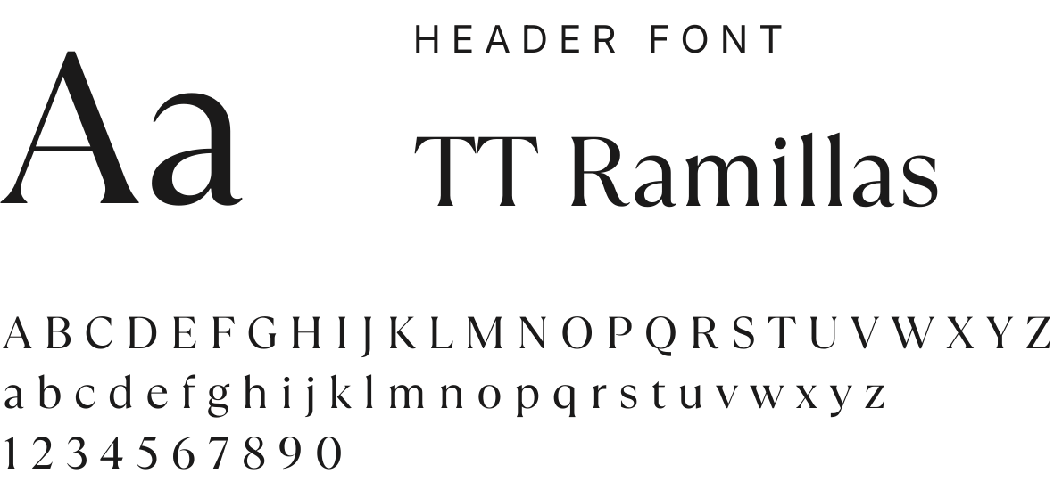
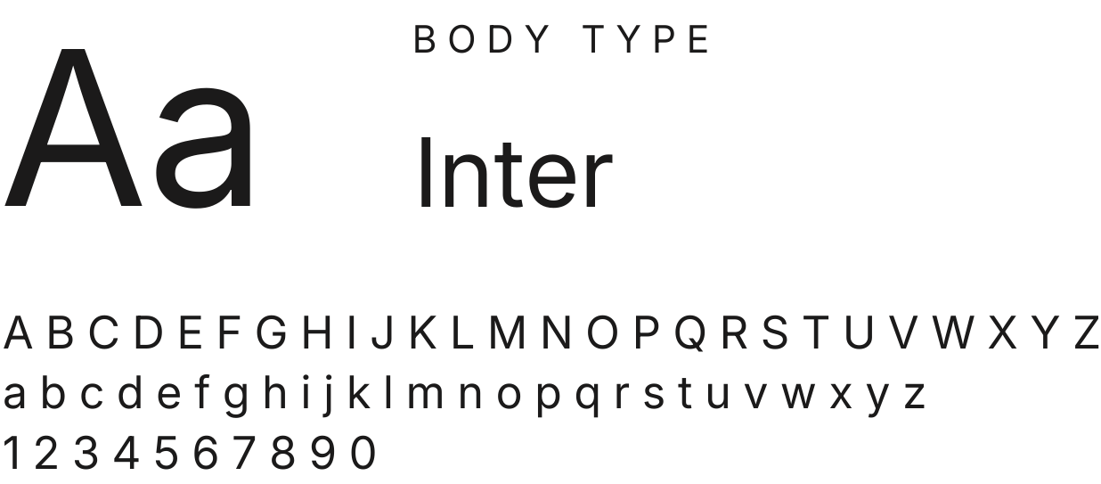
Typeography
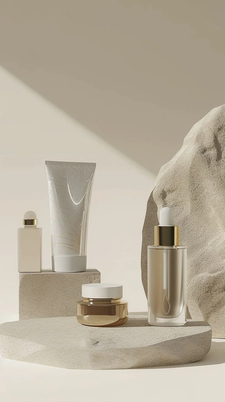
Imagery Moodboard
Voice & Tone
Warm – Empathetic, never urgent
Inclusive – Celebrates skin at every age and stage
Evidence-based – Transparent about ingredients
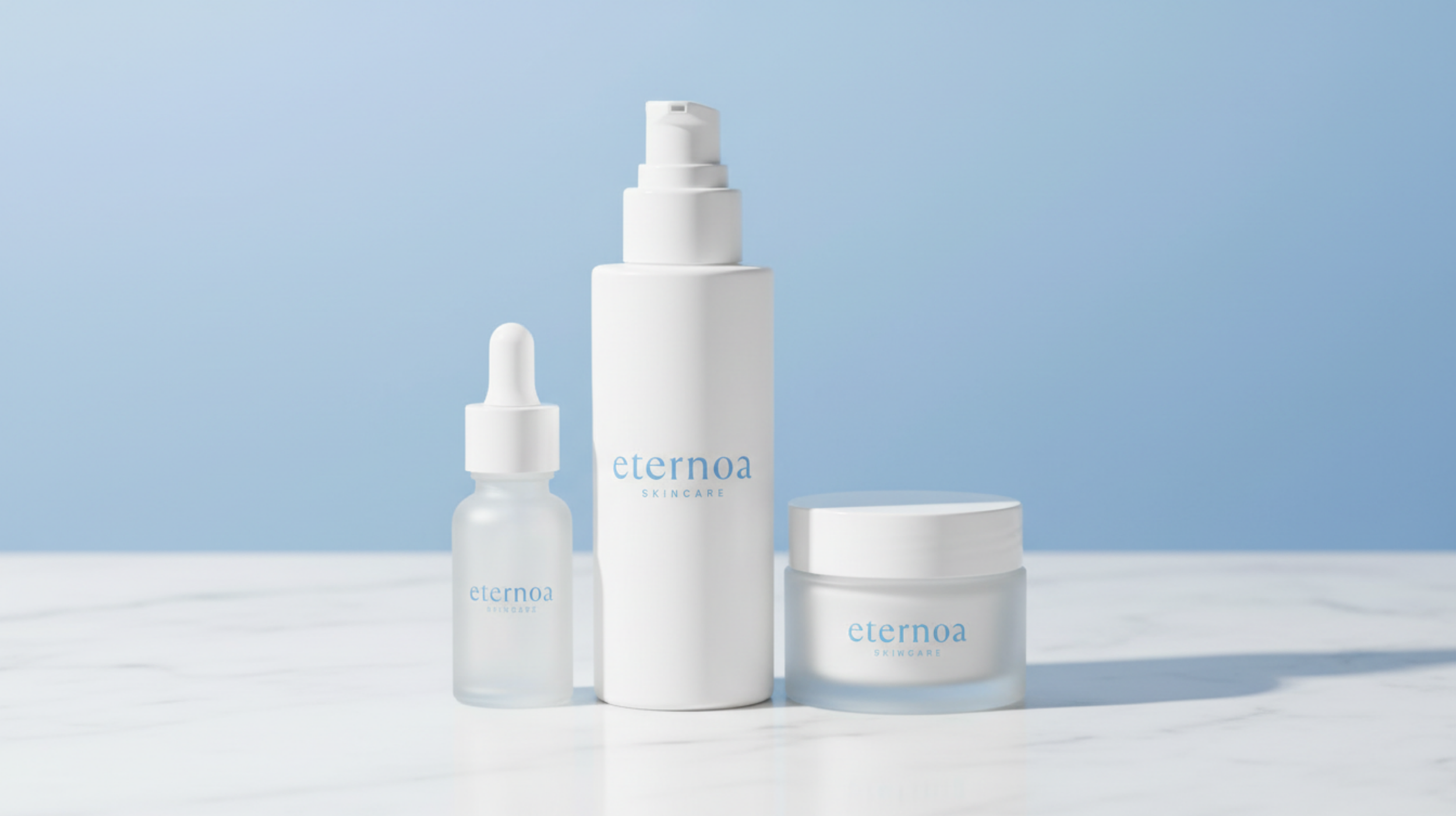
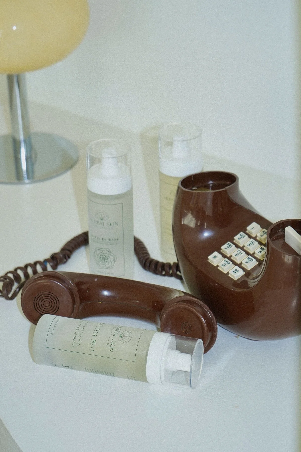
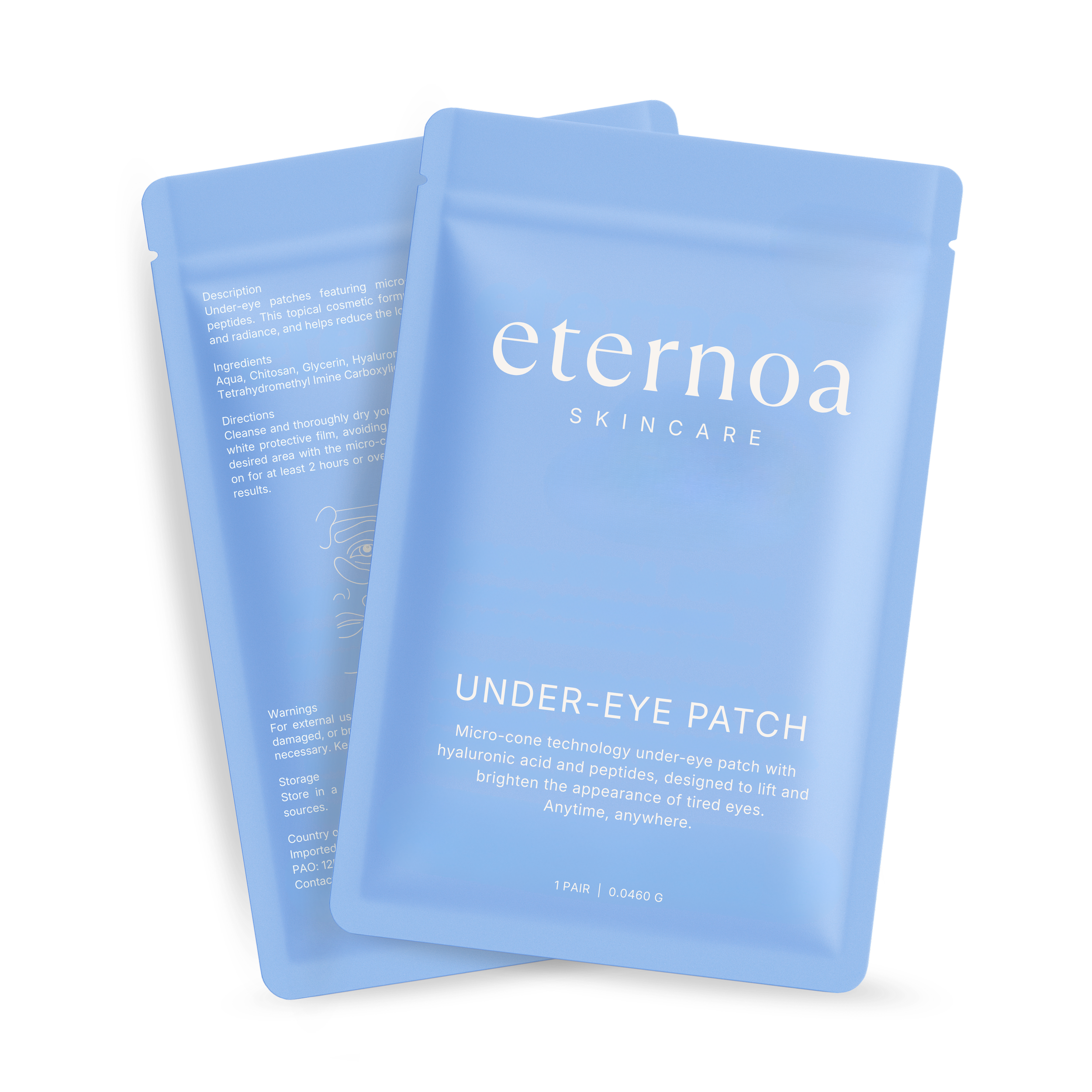
Inspired by popular US skincare brands, Summer Fridays and Tatcha, I redesigned Eternoa’s packaging into a minimal, luxury look by removing unnecessary elements.
Step #3: Mockups
Challenges & iterations
Early design directions skewed either too clinical or too Gen-Z, missing the appeal for women aged 40–65. Through multiple iterations, the brand was refined into a balanced, premium aesthetic, while a flexible visual system was built to support future products beyond a single SKU.
Outcome
Delivered full branding assets for use across social media, print and digital platforms.
